Please write your answers on separate paper from this handout. Please staple your pages together, or at least be sure to sign every page with your name, so that I can grade your homework.
You will probably want to read the sections of Chapter 18 of Understanding Earth called ``Seismic Waves'' and ``Locating the Epicenter'' before you do Question 2. In particular, you should find that Figures 18.10 and 18.11 help you a bit. Section 5 of the lecture notes from Lecture 20 should also be helpful.
If you have problems with or questions about the homework, please come see me at the discussion section or send me an e-mail. My e-mail address is ganderson@ucsd.edu, and the discussion section is held Wednesday evenings from 5:30-6:30 in Warren Lecture Hall 2113.
Question 1: Worldwide Earthquake Rates (20 points)
One of the most common questions seismologists are asked is: ``I've heard that earthquakes are happening more often these days than they used to. Is that true?'' In this problem, you are going to try to answer that question for yourselves.
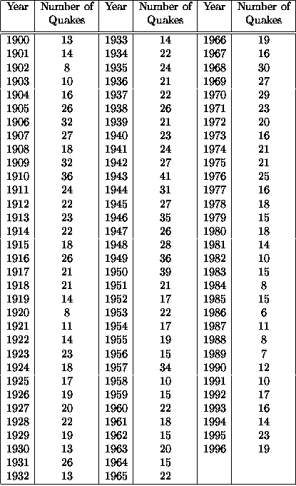
Below, I have made a table showing the number of earthquakes with magnitudes of 7.0 or greater which occurred in each year between 1900 and 1996. These numbers come from the United States Geological Survey's National Earthquake Information Center in Golden, Colorado.
Here's what I want you to do:
One thing: if you make the graph by hand, don't label every year along the X-axis. Instead, make a tick mark every fifth or tenth year, and just label those (of course, you still need to plot the numbers for the other years) -- it will make your graph much easier to read.
Question 2: Where is that dang quake? (30 points)
In this problem, you get to locate an earthquake here in southern California. Normally, seismologists locate earthquakes with fancy math and fast computers, but we will return to the old days of seismology and locate an earthquake by hand.
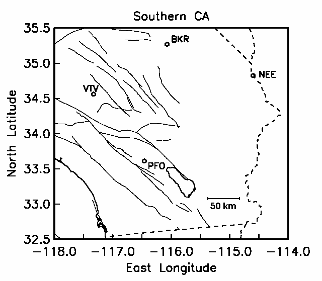
Below, you will find a figure with wiggles made by an earthquake here in southern California on Sunday, 23 February. These are four seismograms made by four different seismometers in locations around southern California. The locations of the stations which made the recordings are shown on the map I've given you, with the three character codes (such as BKR) shown both at the right spot on the map and in front of the corresponding seismogram.
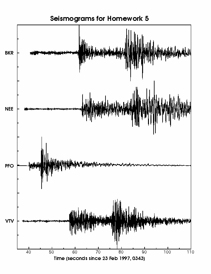
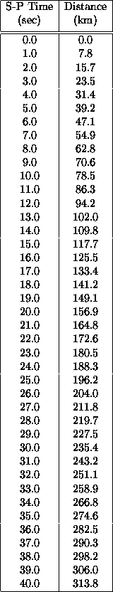
Look at the record from station PFO. You will see that there are two distinct points in the seismogram where the size of the wiggles (what seismologists call the amplitude) goes up compared to the wiggles around them. The first jump is the arrival of the P wave, which is the fastest-propagating seismic wave. The second jump is the arrival of the S wave. By measuring the times at which these two jumps occur (called the arrival times), and then taking the difference of these two times (called the S-P time), you can use Table 2 to figure out how far the earthquake is from the station. The procedure of finding the arrival times for the P and S waves is called ``picking''.
After you know the distance, on your map of Southern California you draw a circle of the correct radius centered at PFO, and you know the earthquake has to lie somewhere on that circle. After you repeat the above procedure for the other three stations, you will have four different circles, which will overlap one another. There should be a small region where the circles all overlap, and you know the earthquake must be somewhere inside that small region. Ideally, there would actually be only a single point, but small errors in measurements and in Table 2 will cause the circles to overlap rather than just touch in a single spot.
Here's what I want you to do:
This is a challenging problem. If you have questions on it or get stuck, come see me. I can't help you get unstuck if you don't ask me for help.
Here is your map of southern California with the stations indicated.
Greg Anderson